Profile widget
The Profile Widget provides users with an overview of their gamification programme. While usually embedded in the Header Widget, it can also be rendered as a standalone element in any HTML container.
Below are screenshots of the widget in action:
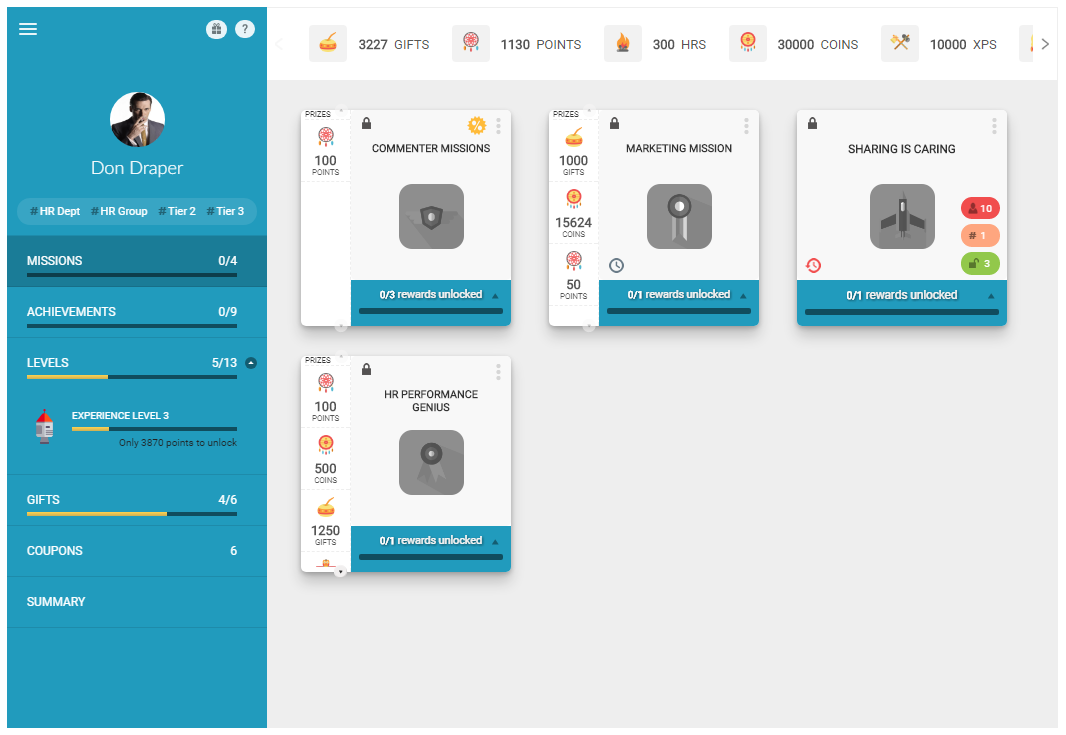 Profile widget showing the missions tab with available missions
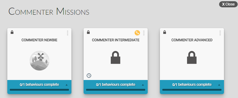 Tool tip showing additional mission information on hover
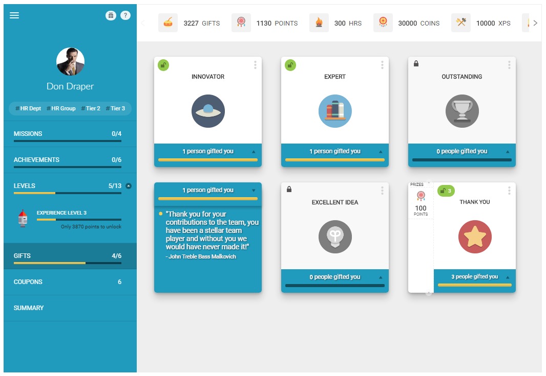
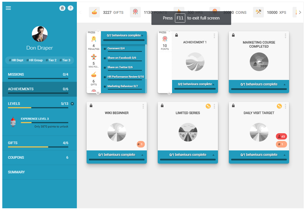 Profile widget showing the achievements tab
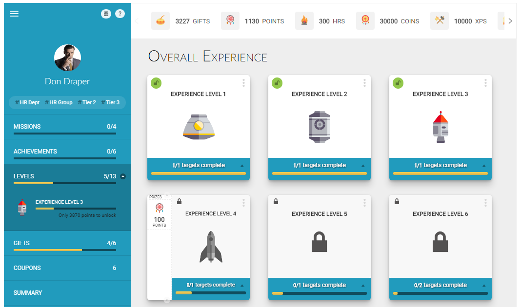 Profile widget showing the levels tab with user progression
 Profile widget showing the gifts tab
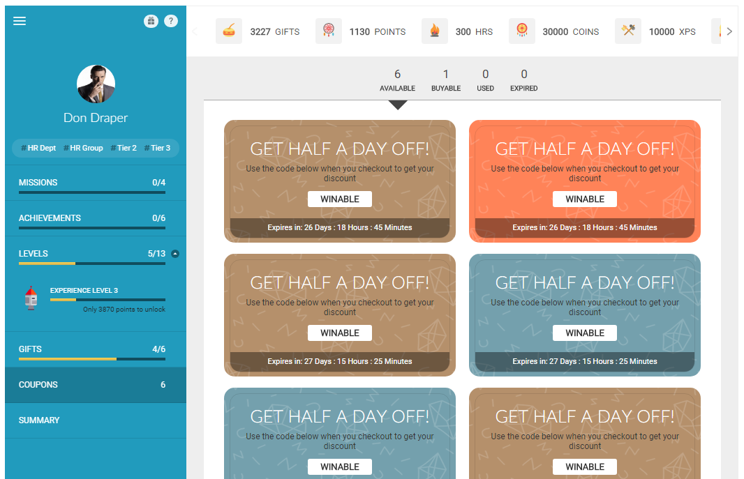 Profile widget showing the coupons tab
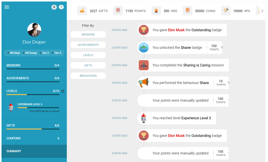 Profile widget showing the summary tab with overall statistics
Implementation
To render the Profile Widget, add a call to the Mambo profile() function in the mamboCallbacks() array. The example below shows the function call with all available options. None of these options are required, so you could simply use: Mambo('.selector').profile().
Configuration options
Each option found in the code above is explained in detail below. None of these options are required.
Basic display options
| Option | Description | Default Value | Sample Value |
|---|---|---|---|
| hasPicture | Determines whether the user's pictureUrl should be used to display the profile picture in the widget. | true | false |
| hasProfileLink | Controls whether the user's name should be a link to their profile page. The link will be taken from the user's profileUrl property. See the User APIs for more information. | false | true |
| hideOnError | Hides the widget if there is an error retrieving the user's data from the server. When set to true, the widget will only be shown after successfully retrieving user data, meaning no "Loading..." message will be displayed during data fetching. | false | true |
| uuidOverride | Allows you to override the default UUID initialised on startup with a custom UUID. This enables User A to view User B's profile information when navigating to User B's profile page. | N/A | unique_user_id |
Points-related options
| Option | Description | Default Value | Sample Value |
|---|---|---|---|
| hasEarnPoints | Controls whether the "How do I earn Points?" link is displayed. It is highly recommended to leave this option enabled. | true | false |
| earnPointsUrl | Provides an alternative behaviour for the "How do I earn Points?" link. By default, this link opens a popup window showing all available behaviours the user can perform. If earnPointsUrl is set, the link will instead open the specified URL. | N/A | http://site.com/user |
| pointOpts.show | Determines whether points should be displayed in the profile. | true | false |
| pointOpts.img | Controls whether images associated with points should be displayed. These images can be uploaded through the Administration Panel. | true | false |
| pointOpts.abbr | Controls whether points should be displayed using abbreviated units of measure. When false, the full unit of measure is used. | true | false |
| pointOpts.exclude | Specifies which points should not be displayed. Takes an array of point IDs, which can be found in the Administration Panel when editing a specific point. | null | ['pointId'] |
| pointOpts.include | Specifies which points should be displayed. Takes an array of point IDs, which can be found in the Administration Panel when editing a specific point. When both include and exclude are specified, the include list takes precedence. | null | ['pointId'] |
Gifting options
| Option | Description | Default Value | Sample Value |
|---|---|---|---|
| hasGifting | Controls whether the Gifting link is displayed. When clicked, this link opens the Gift Widget popup, allowing users to recognise each other with badges and/or points. | true | false |
| giftOpts | Allows customisation of the Gift Widget that appears when the Gifting link is clicked. For full details, refer to the Gift Widget documentation. | N/A | N/A |
Tab display options
| Option | Description | Default Value | Sample Value |
|---|---|---|---|
| tabs.hasKPIs | Controls visibility of the KPIs tab. | true | false |
| tabs.hasMissions | Controls visibility of the Missions tab. | true | false |
| tabs.hasLevels | Controls visibility of the Levels tab. | true | false |
| tabs.hasAchievements | Controls visibility of the Achievements tab. | true | false |
| tabs.hasGifts | Controls visibility of the Gifts tab. | true | false |
| tabs.hasCoupons | Controls visibility of the Coupons tab. | true | false |
| tabs.hasSummary | Controls visibility of the Summary tab. | true | false |
| tabs.selected | Specifies which tab should be selected when the Profile Widget is first rendered. Valid values include: kpis, missions, achievements, levels, coupons, and summary. For custom tag-based tabs, use the tab ID (tags joined by underscore, e.g., hr_dept_hr_group). | kpis | achievements |
| tabs.custom | Allows creation of custom tabs based on tags. The example shows how to add tabs for 'Marketing' and 'HR' rewards. | null | [{title:'Marketing',tags:['marketing']},{title:'HR',tags:['hr']}] |
KPI display options
| Option | Description | Default Value | Sample Value |
|---|---|---|---|
| tabs.kpis.label | Allows you to override the default tab name for KPIs. | KPIs | Performance |
| tabs.kpis.filters.daily | Controls whether daily filtering is available for KPIs. | true | false |
| tabs.kpis.filters.weekly | Controls whether weekly filtering is available for KPIs. | true | false |
| tabs.kpis.filters.monthly | Controls whether monthly filtering is available for KPIs. | true | false |
| tabs.kpis.filters.quarterly | Controls whether quarterly filtering is available for KPIs. | true | false |
| tabs.kpis.filters.yearly | Controls whether yearly filtering is available for KPIs. | true | false |
| tabs.kpis.filters.selected | Specifies which time period filter is selected by default. Note that user selections are stored as preferences. | monthly | weekly |
| tabs.kpis.filters.presentOnly | Determines if users can select any time frame or only the present time frame. When false, users can select specific past dates. When true, options are based on today's date (Today, This Week, This Month, etc.) | false | true |
Image size options
| Option | Description | Default Value | Sample Value |
|---|---|---|---|
| imgOpts.picSize | Controls the size of the user's profile picture displayed on the left side of the Profile Widget. Valid values: small, medium, large. | medium | small |
| imgOpts.badgeSize | Controls the size of badges (excluding KPIs) in the Profile Widget. Valid values: small, medium, large. | small | medium |
User data options
Where the user has no name at all, the profile shows the Anonymous label. Supply your own name and picture with these options, or with the users options if every widget on the page should draw on the same source.
| Option | Description | Default Value | Sample Value |
|---|---|---|---|
| userName | Which name to show for the user. Valid values: fullName, firstName, lastName, displayName. Where the user has no such name, the Anonymous label is shown. | fullName | displayName |
| userResolver | Function supplying the user's details. Only useful alongside uuidOverride, since otherwise the profile shows the same user as the rest of the page. | null | function(uuids, ctx) { ... } |
| userData | A map of uuid to user details, used in place of a resolver when the data is already on the page. | null | {'0001': {firstName: 'Ana'}} |